
PILLAR
Improving the experience and outcome of Individual Education Programs (IEPs)
Pillar is a student management system that streamlines and simplifies the management of Individual Education Programs. Four different user types can utilise this tool in order to better the child’s outcomes; school administrators, teachers, parents and support professionals.
What problem are we solving?
Currently, IEPs are a haphazard combination of different files and scanned papers that are difficult to collate and process holistically. Pillar is a centralised platform where those involved can better manage IEPs. This will in turn mean the student’s needs are better handled.

Workshops & Research
My involvement
I led the design project from initial workshops with the client, through to full high fidelity prototype. Throughout the entire process, I worked closely with the client and product strategist to ensure we were on target and solving the problem the client envisioned.

Presented to clients
Sketching
Presented to clients
Wireframe Prototyping

Presented to clients
Branding

Presented to clients
High Fidelity Prototyping
🤔 Design critiques & discussions throughout all stages
IDEAL STATE:
Hold more discovery interviews with different user types that would use the platform; school administrators, teachers, other parents, and support professionals. Card sorting would be a great activity to include in these sessions. This would give me qualitative data on user needs, information hierarchy and architecture, and key actions required for the MVP.
Gain access to competitor or adjacent web apps. This would help me see how similar problems are addressed, what solutions are working, and ways we can work towards a strong Unique Selling Point. Mobbin felt insufficient as the only reference point.
Further research into any legal requirements for technology used in schools.
Research
In order to understand the users of Pillar and how they would interact with the platform, I created user personas, mapped out user journeys, and conducted discovery sessions with the clients. This helped inform my early iterations of user flows, information architecture, and user permissions.
I studied IEP documentation to understand their purpose, the hierarchy of information, and how they are used by different user types.

Sketches
I mapped out the core screens for the project to align with the client on feature scope, and to begin exploring information architecture and content. This stage also helped me establish clear high-level permissions for the different user types. As this project included a lot of specific content, I kept these sketches brief and non-detailed to capture bigger picture items.
IDEAL STATE:
Validate these sketches with more end users. This would help me learn if the solutions I have iterated would meet their needs, and uncover any blindspots or oversights at this stage.
Conduct viability, feasibility and desirability sessions with engineers and product managers to assess solutions from an effort and timeline point of view. This would help me understand which solution is appropriate for version 1 based on timeline and scope constraints.

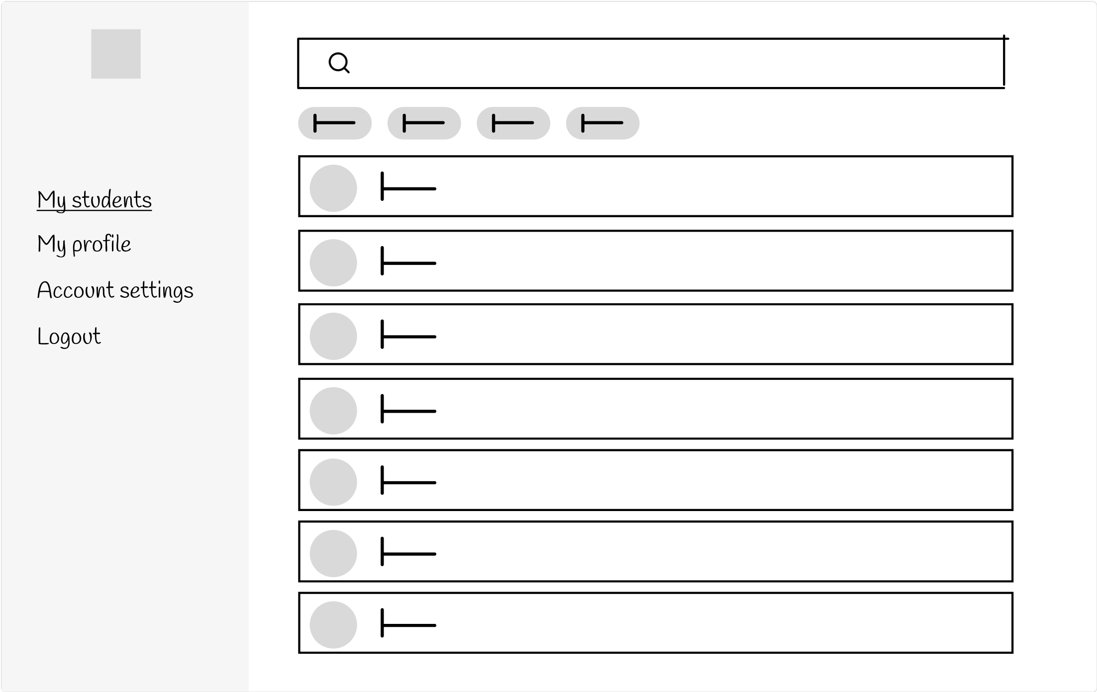
Wireframes
I built out a full wireframe prototype of the student management system with four unique flows to capture each user type’s experience. This stage helped me formalise user permissions based on user type, and allowed me to test functionality, clarify information architecture, and solidify user flows.
IDEAL STATE:
Validate wireframe designs through moderated and unmoderated usability testing. This would help give me qualitative and quantitative data to validate or challenge design solutions.
Conduct viability, feasibility and desirability sessions with engineers and product managers for key flows or screens to ensure the designs meet technical and business constraints.
Present to wider business unit, business analysts and relevant stakeholders to uncover any blindspots or use case scenarios that impact the current designs.
Branding
The client wanted a product that felt modern, clean and trustworthy. I presented two concepts to the clients who selected this one.
I used a confident, modern primary colour that is used sparingly throughout the designs to guide flows and simplify actions. I divided content into cards to help minimise cognitive load. I utilised secondary and tertiary colours to represent goal statuses and subjects.
IDEAL STATE:
Put the branding through more accessibility tests to ensure it meet accessibility requirements.
Conduct A/B testing to end users to see which UI they respond best to.

Hi-Fi prototype
I designed a full high fidelity prototype that drew upon learnings from my wireframe testing sessions, and branding presentation feedback. I limited my colours to interactive elements and informative graphics to help the user understand and digest the content as easily as possible. I tested this prototype with users and presented it to the client to ensure our different user types are able to complete the actions they need to, in a delightful, intuitive way.
IDEAL STATE:
Conduct moderated and unmoderated testing to validate the designs both in terms of UX and UI.
Collate applicable data to populate System Usability Scores (SUS) to validate usability and uncover friction points. These scores can also be shared with key stakeholders to win confidence.
Present to wider business unit, business analysts and key stakeholders to validate designs from multiple business and user perspectives.
Conduct viability, feasibility and desirability sessions with engineers and product managers to ensure designs are within technical and business scope.
Explore interaction and event tracking opportunities to instil future data points that will inform updates and iterations.

Development
Assist product manager in creating stories and tickets to divide up features for sprints.
Create dev-ready file with annotations and clear markers on features and flows.
Present designs to engineers to communicate design decisions.
Align with product manager and lead tech on current feature work ensuring designs are up-to-date and have sufficient guidelines and annotations.
Attend stand ups to field any design-related questions.
Field any questions that come through on tickets in Jira.
Iterate designs based business needs and timelines, as well as user feedback.
Key challenges
Challenge: How do we safely assign a student to a school?
Original flow: School adds student via their USI to their student list. If the student has a pre-existing student profile, it will populate to the school’s account.
Alternate flow: To protect student information and ensure students aren’t on school lists that aren’t relevant to them, we updated this flow to put power in the hands of the guardian. The guardian initiates a request to be added to a school list, and can remove any links to schools through their own portal.
Challenge: Four different user types with different permissions and goals
Solution: With information gathered in discovery and research, I journey mapped four different user journeys to have a clear idea of actions and flows.
I also mirrored components as much as I could across the four different user views to minimise dev effort.
What next for Pillar?
Due to business and client limitations, the design process for Pillar did not go through sufficient validation with end users, engineers, product managers, and the education industry. For this, it will be vital that user behaviour and feedback is captured, and then put into a list of priorities for subsequent iterations.
For school buy-in, it will also be essential that Pillar explores integrations and ways to automate the process to encourage adoption of the product.
Challenge: How do we ensure school buy-in?
Solution: Provided a dashboard for school administrator users to add value to the platform. Focused on UI that is intuitive and clean, and information hierarchy to minimise cognitive overload.
I also encouraged the client to explore integrations to allow schools to be set up quicker, and to think about automation where appropriate.
Challenge: Communicate goals that require more attention without marking them with an alert or warning
Solution: Used a secondary colour to represent the different statuses of the goals (draft, pending approval, open, open-revised, closed). The colour darkens as the goal moves through the different statuses with ‘open-revised’ being the darkest, and ‘closed’ being lightest. This means the user can quickly see if more goals are requiring attention (darker) or not (lighter).